Visual Studio 2010 - How It Should Have Looked
A few years ago (before Twitter, StackOverflow, DotNetKicks), one of my great sources of info was CodeProject.com. I remember some of the great articles from that time. When Visual Studio 2010 came out, it reminded me of something I saw over 4 years ago on that site a concept of the Visual Studio 2010 IDE.
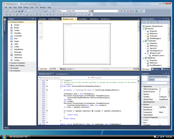
If you have installed Visual Studio 2010, you can note it has a new look and feel. It has a new skin/theme. It resembles an Expression Blend feel. The shell of the IDE is using WPF technology. It pretty much looks like the screen shot below:
As mentioned above, a while ago I came across an article on CodeProject that really had a great set of ideas. I really hoped that Microsoft would adopt some of these concepts. Take a look at some of the screens below:
Visual stack trace idea is really neat and the concept UI looks a lot "cleaner" and softer on they eyes than Microsoft's version

Concept IDE that shows error trapping

You can check out the full article with all of the author's ideas on CodeProject here (http://www.codeproject.com/KB/cs/concept_ide.aspx). It is a shame that Microsoft's version hasn't really changed all that much since Visual Studio 2003. Obviously, a lot of these concepts are provided in different ways and with other add-ins. In fact, I think with the new WPF shell we might even see these new concepts come to life. However, you can see that over 4 years ago the concept IDE was pretty advanced and even holds up by today's standards of modern UIs.